Being a guide to portrait photography cleverly masquerading as a technical analysis
Like the topics we covered in the beginner’s guide last month, depth of field might initially seem complex, but behind it is some relatively simple logic and maths. Don’t worry if maths isn’t your strong point: long equations are the crutch of the inarticulate, and there’s nothing in this article more complicated than division.
Speaking of division, I like to divide photography into two broad disciplines. Portraits are photos of a particular object (not necessarily a person), designed to capture something about that object. Landscapes are photos of a scene (not necessarily outdoors), designed to capture the sensation of being in a place. I say that this is a disguised guide to portrait photography because mastering depth of field is one of the main skills you need to take great portraits. Whether you’re keeping the whole scene in focus for an environmental portrait, or using a very shallow depth of field to emphasise just the eyes of your subject, you need to understand how to get exactly the right depth.
On categorisation
me this fascinating bonus content
My definition of a portrait is not the conventional one. Wikipedia defines it as a photo that “captures the likeness of a person or a small group of people, typically in a flattering manner”, but I think that is too restrictive.
John Shaw once said that he considers himself to be a portrait photographer whose subjects are animals and plants. I like this way of thinking: if your photo has a subject, approaching the photo as you would a portrait of a person will put you in the right frame of mind to make photos that will convey the reason that you wanted to photograph your chosen subject.
Likewise, approaching a photo of any scene in the same way that you would a landscape offers a similar advantage.
Of course as soon as you try to impose a neat 2-way classification onto a subject such as photography / sexual orientation, you notice problems. Not all photos / people can be neatly classified as portrait or landscape / gay or straight.
For example, architectural photographs / bisexuals often have a definite subject / attraction to men as well as a compelling vista / taste for ladies.
On the other hand, abstract photographs / transgender individuals may technically be portrait or landscape / gay or straight, depending on whether you decide to classify them as being of a subject or a scene / male or female but are sufficiently different that it might make more sense to consider them a genre / orientation in their own right.
This difficulty says more about the classification system than it does about the photos / people being classified. As a portrait photographer / conservative politician, don’t let your ideas of what kind of photography / public lifestyle you should be engaging in get in the way of your fun. Put aside your preconceptions / wife grab your camera / dark mackintosh and head for the nearest national park / public toilet where I’m sure…
OK, I think this analogy has gone far enough :o)
Depth of field terminology
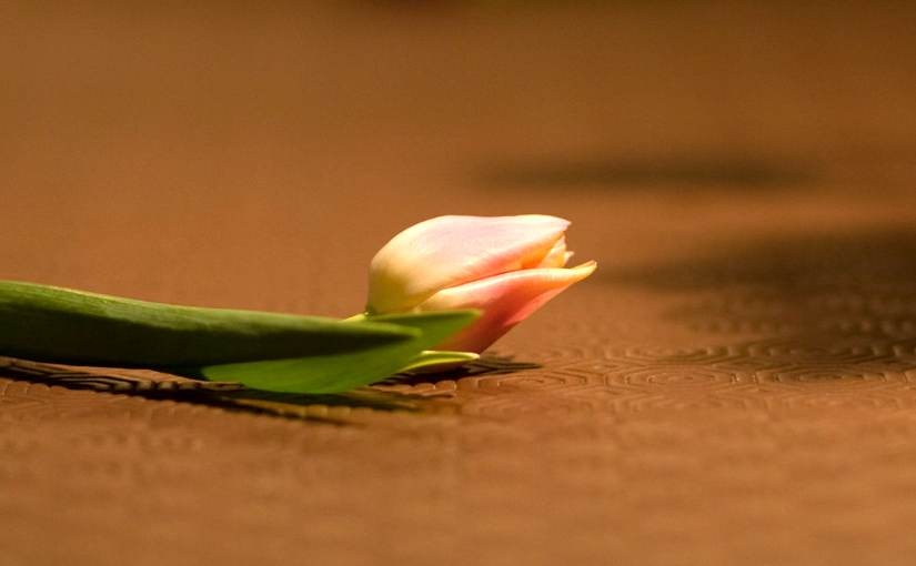
The following image depicts a (fake) flower about 50cm away, with a hedge around 5 meters behind it. This is an example of narrow depth of field: notice how some of the petals are sharp, others are slightly soft, and the hedge is almost blurred out of all recognition. Below it is a version with very wide depth of field.

- Depth of field
- The range of distances in a photo within which the image appears sharp. In this photo the sharp region starts about 49cm from the camera lens and extends to 51cm, giving a depth of field of 2 cm. Any point outside of this range appears blurred into a disc.
- Blur
- The size of the blur discs as measured in the real world. This is tied to depth of field: the larger the blur, the narrower the depth of field.
- Circles of confusion
- The size of the blur as measured on the photographic image.
Blur vs circles of confusion: Consider the rightmost petal and the leaves in the bottom right. The blur – measured in the real world – is around 2mm and 20cm respectively, and the circles of confusion – measured on the image – are around half a millimetre and 5mm respectively. When measured in the real world the leaves are 100 times more blurred than the petals, but measured on the actual photo they are only 10 times more blurred. This is because of perspective: the leaves are 10 times further away from the camera than the petals are, so the ratio of the two kinds of blur are different by a factor of 10.
I just measured those circles of confusion by counting pixels in the above image. This is valid, but inconvenient because the values would change if I altered the size of the image. For this reason, circles of confusion are usually measured on the camera’s sensor.
Over the rest of this article I’ll explain the physics behind blur and sharpness, so that you can learn to precisely control the look of your photos. An explanation of depth of field often starts with a list of rules. These do exist, and I list them at the end of the article, but the whole premise of a Geek’s Guide is that the rules are easier to learn if you understand the mechanism behind them first.
Onwards…
What causes blur in a photo?
First of all, consider a pinhole camera with no focusing capability and infinite depth of field:
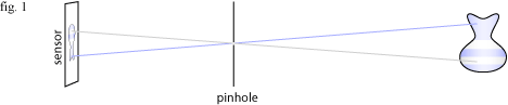
Light from each point in the scene enters the pinhole, forming an upside-down image on the sensor. Unfortunately, the vast majority of the light is wasted. Each point on the vase is emitting light in every direction, but only the light that happens to be emitted exactly in the direction of the pinhole will be captured. So little light comes in through the pinhole that you need long shutter speeds to expose the image. Also the small pinhole creates a very soft image due to diffraction. In order to allow more light in, the pinhole is replaced by a wide aperture and a glass lens to bend the light so that it still forms a sharp image on the sensor:
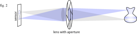
The lens works by bending light so that the rays emitted from any point on the subject have a larger target to hit, but still form a sharp image on the sensor. So far so good, but there is a cost. In the pinhole camera, all objects are equally in focus. With the lens, the focus must be adjusted for a subject. You tell the lens how far away the subject is, and it will make sure that light radiating from that distance is brought back to a single point on the sensor. The slice of the world that is in focus is called the focal plane.
So what about objects that are not on this focal plane? Light rays from points on these other objects will still be bent back to a single point by the lens, this point will be slightly in front or behind the sensor. If the object is in front of the focal plane then the light rays will not have enough distance to converge; if the object is behind the focal plane the rays will converge before the sensor and cross over. Either way they appear in the image as a blurred disc the same shape as the aperture. This disc is called a circle of confusion.
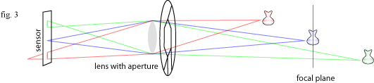
I find this model a bit hard to use to visualise the depth of field in a photo, but fortunately there is a much simpler one for predicting the size of the blur: imagine a pair of imaginary lines starting at the aperture and crossing over at the plane of focus. Any object not on the plane of focus will be blurred into a disc the size of the distance between the lines.
An example

This photo was taken with an 85mm lens at f/1.8, which means that it has an aperture width of 47mm.
The bottle is one meter from the camera, and half a meter behind the bottle are two candle flames which are blurred into discs.
According to the simple model above, since the candles are half as far from the focal plane as the camera is the circle of confusion should be half the aperture width, or 23.5mm. Measuring the discs in Photoshop, I find them to indeed be just over 23mm wide. Not bad.
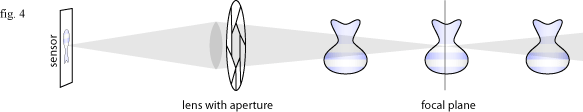
The rule for calculating the blur according to the model in figure 4 is that if your subject is x meters away, an object that is x meters away from the subject will be blurred into a disc the size of the aperture, an object 2x meters behind the subject will be twice the size of the aperture, etc…
The size of the circle of confusion created by the candle flames is 2.14mm measured on the camera’s 35mm sensor.
Aperture shape and bokeh
Bokeh, pronounced with the ‘bo’ of ‘bombastic’ and the ‘keh’ of ‘Ken Livingstone’, is a term used to refer to the quality of the blur in the out of focus areas.
Circular bokeh is generally perceived to be the most pleasing. Any lens will produce circular bokeh when wide open, but when stopped down the bokeh takes on the polygonal shape of the aperture. Many people spend a lot of money on lenses that have great bokeh because they have wide apertures, are sharp even when wide open, and use many curved aperture blades to round out the polygonal shapes even when they are stopped down. Such people are called bokeh whores, and can be easily observed in their natural habitat of the flickr forums.
If one was so inclined, one could modify the shape of the aperture using a piece of card to produce any shape of bokeh you want:

Photo from a tutorial on DIY Photography.net, used with permission. More examples.
Obtaining sharp images
So far we’ve been talking about the size of the blur in the out of focus areas, now lets turn to the sharp area.
Firstly, we need a definition of what qualifies as ‘sharp’. Technically speaking, only the 2D slice of the world lying exactly on the plane of focus is perfectly sharp (and even then, only if the lens is a perfect optic, which it isn’t). However, since our eyes are even less perfect, we can use the more useful definition that a part of an image appears sharp when its resolution exceeds that of the human eye.
geeky aside: how to measure the size of the blur
Measuring real-world blur size
I measured the distance between the flames with a ruler: 38mm.
I took a second, underexposed photo with the same aperture, in which the circles were clearer:
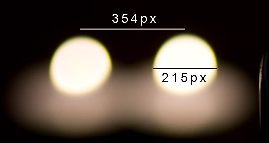
With these measurements we can calculate the size of each pixel at the distance of the flames: 38 / 354 = 0.107 millimetres per pixel.
The discs are therefore 23.1mm wide (0.107 x 215)
So what is the resolution of the human eye?

In this image you can see a band crossing the flower petals and rising up the side of the vase in which everything seems to be sharp (it is clearer in the large version – click to open it). This is the range either side of the focal plane where the circles of confusion are so small that they appear as points.
How small do the circles have to be before they look like a single point? In an exhaustive analysis, Wikipedia tells me that assuming that you’re going to make 25cm wide prints and view them from a distance of 25cm, then you will perceive any circle less than 0.2mm wide as a single point.
This means that a circle of confusion must be no bigger than 1/1250 of the image width if the image is to appear sharp. This translates into a minimum circle of confusion of 1/1250th of the sensor size. For 35mm cameras, the value 0.03mm is often used.
geeky aside: fact checking Wikipedia
So, the minimum detail we can perceive from 25cm is 0.2mm eh? That sounds about right but you should always distrust figures you find on the internet, except for this article of course.
Unfortunately I didn’t have a 5 line pair per millimetre grid lying around the house, but I do have a nit comb, presented here with a tiny little chilli for no good reason:
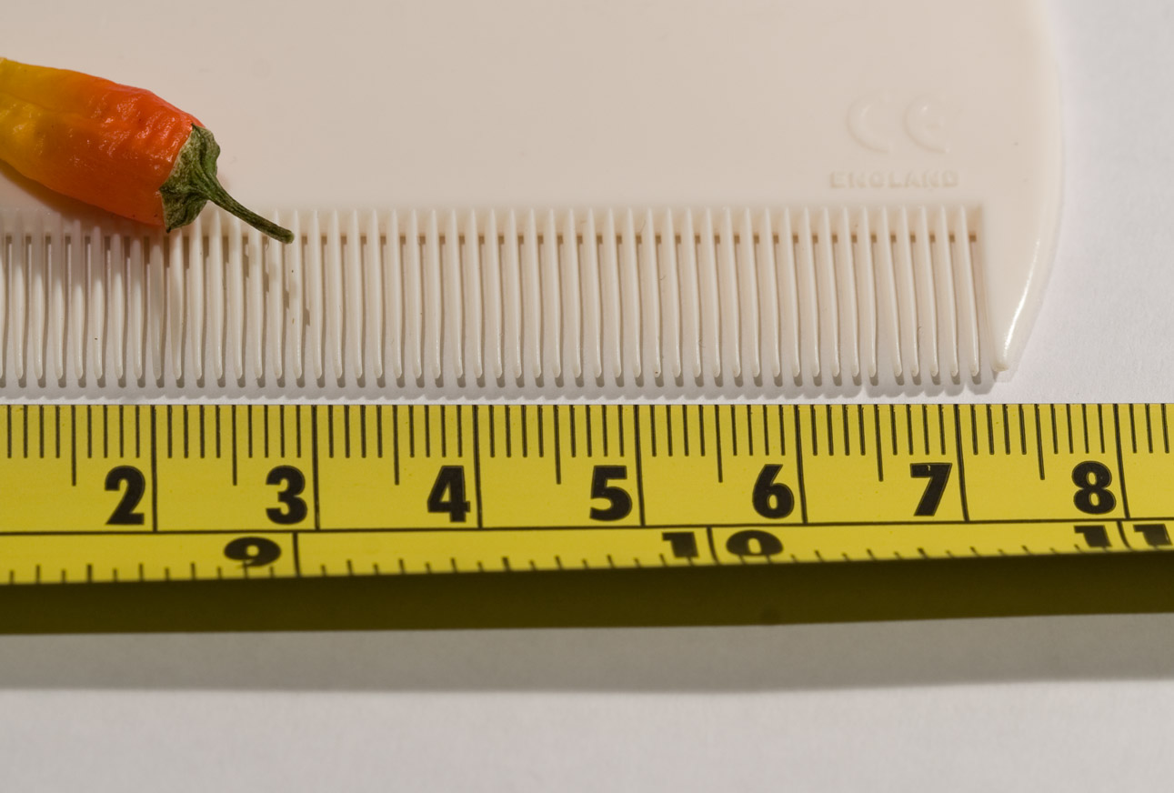
The prongs on the nit comb are 1.2 mm apart. I walked backwards with one eye closed until the individual prongs started to merge together at 170cm away. 170 is around 7 times further away than 25cm, so my feat is equivalent to resolving a 0.17mm detail at 25cm: pretty close to the claimed value.
OK Wikipedia. You win this time.
Note that this is the minimum acceptable sharpness. If you’re a perfectionist or plan to make larger than A4 sized prints, you should strive to get your images even sharper.
Super sharp shooter shooting super super super sharp shots*
Most digital cameras are capable of greater resolutions than this 1/1250 of the image width, and just because you can’t see any resolution above 0.2mm from 25cm away, it doesn’t mean that any sharpness beyond that point is wasted. Firstly, you might want to print the image larger, or view it closer, than the values assumed above. Secondly, you may want to crop an image to enlarge a small portion of it. Finally, random visitors on flickr might pixel-peep your images on maximum magnification.
Here are some tips for obtaining images even sharper than ‘sharp’.
- Always use a tripod if possible, or alternatively a shuter speed of twice the normal recommendation of 1/<focal length>. e.g. for a 100mm lens, try and use a shutter speed of 1/200 second.
- By default, shoot at your lens’ sharpest aperture (typically f/8 or f/11 on SLR lenses) even if you don’t need all that depth of field. Especially avoid shooting wide open with cheap lenses: budget lenses tend to improve greatly when closed down 2 stops
- When using hyperfocal focussing (more on this later), double the recommendation of your depth of field calculations: if you reckon you need f/5.6 to get a sharp image, use f/11
- Avoid f-numbers higher than f/16: diffraction will degrade the image quality.
- Where the two previous rules contradict, consider recomposing the shot so that it doesn’t require quite so much depth of field, or using focus stacking (see the last section of this article)
* obscure British drum and bass reference
Visualising the depth of field
It’s imaginary line time again. Picture a cone extending from your lens to infinity, always 1/1250th the width of your image. I’ll call this the sharpness cone because as far as I know there’s no accepted name for it. If the blur discs are smaller than this cone, the image appears sharp. Using a 24mm lens which has a 72 degree angle of view on a full frame DSLR, this cone will be around a millimetre wide one meter from the camera, and a meter wide one kilometre from the camera.
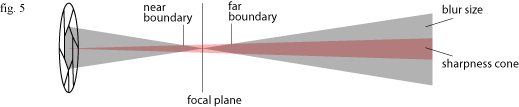
Between the near and far boundaries where the blur is smaller than the sharpness cone, the image will be perceived as sharp. The distance between the two boundaries is the depth of field.
Calculating the size of the depth of field
There are equations for calculating the near and far boundaries, which I shall include here even though I don’t fully understand them so that we may share a sigh of relief when I introduce a nifty gadget that calculates them for you:
Yuck. Since pausing for a minute to use a calculator interrupts the creative process a bit, people use depth of field charts. I might not fully understand the above equation, but I can count that it has 4 variables. A single chart applies to one combination of focal length (f) and sensor size (c), leaving two variables left: subject distance (s) and aperture (N). The chart is a grid of the result of the above equations for every permutation of subject distance and aperture.
Go generate charts for all your lenses here: www.dofmaster.com/doftable.html. You use the chart by finding the row representing the subject distance, then selecting an aperture from that row that gives you the depth of field you need.
If you look at the bottom row of these charts, you will see that they have a figure for each f-number called hyperfocal distance.
Hyperfocal distance
Sometimes, especially during landscape photography, you want the whole of a scene to be in focus. In order to do this you use hyperfocal distance focussing. This can be explained in terms of concepts already covered in this article: the hyperfocal distance is the closest distance you can focus on at which the blur discs behind the plane of focus are always smaller than the sharpness cone. In other words, the red and grey lines in figure 5 never cross over and there is no far focus boundary: very distant objects are in sharp focus.
When you are focussed on the hyperfocal distance, everything from half that distance to infinity will be sharp. For example, the hyperfocal distance for an 85mm lens at f/8 is 30 meters; focus on 30 meters and everything from 15 meters to infinity will be sharp.
Bear in mind when using hyperfocal focussing that it will produce “acceptably sharp” images according to the 1/1250th rule. However, if you don’t actually need all that depth of field it is possible to get sharper images. If the subject you’re shooting with the 85mm lens is 100 meters and there is no foreground that needs to be sharp, just focus on the subject!
The aesthetics of depth of field
The effect of focal length and aperture on depth of field has been mentioned above but a picture, as they say, is worth a thousand words.
The effect of focal length
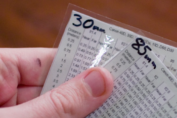
Assuming that you change position to keep the subject filling the frame, focal length does not affect depth of field. However, the perspective causes the image to look different.


Look at these two photos large (click them to view the large size). At first glance the 85mm one looks like it has a thinner depth of field, but in fact this is not the case: in both photos the sharp area is about two squares of tablecloth thick, just enough to get the petals and the leaf sharp. In the second shot the perspective compresses the scene, causing the same depth of field to take up less space on the image.
Likewise the flower in the background is just as blurred in the second shot, but the circles of confusion are larger because the flower is larger. If you resize the flowers to compensate for perspective, you can see that the blur is identical.
The effect of aperture


’nuff said.
The natural laws of depth of field…
There are some laws governing the relationship between these factors, which I shall call the Natural Laws of Depth of Field, highlighted in bold to convey an appropriate sense of gravitas. If you are one of those people who imagines the author speaking as they read an article, you may cast my voice in an “Ian McKellen as Gandalf” tone for this section.
Each of these rules explained in terms of the grey and red lines in figure 5, so here it is again for reference:
- 1. Larger apertures cause narrower depth of field
- Increasing the size of the aperture increases the angle of the grey lines.
- 2. Closer subjects cause narrower depth of field
- Bringing the subject closer to the lens increases the angle of the grey lines. Remember: Ian McKellen voice.
- 3. Cameras with larger sensors give more blur with a given focal length and f-number
- This is a corollary of the previous rule: because full fame DSLRs have a wider angle of view than cropped DSLRs, you have to get closer to the subject to take the same picture with a particular lens.
- The other way of looking at it is that with a full frame DSLR you have to use a longer focal length lens to get the same angle of view as a cropped DSLR, and that longer lens will have a physically larger aperture. Either way the effect is the same.
- 4. As long as your subject fills the frame, depth of field depends only on f-number, not focal length.
- Increasing the focal length and then moving back to keep the subject filling the frame keeps depth of field and blur constant, but increases the size of the circles of confusion because of perspective. Increasing the focal length increases the physical size of the aperture, but at the same time you move backwards, so the angle of the grey lines in figure 5 does not change.
- This is why telephoto lenses are good for background control in portraits: they make the background appear more blurred without sacrificing depth of field on the subject. (Also, because the telephoto lens includes less of the background, it is easier to select a less complicated bit of background for the composition)
- 5. Zooming in on a subject (increasing focal length while maintaining the same position) massively narrows the depth of field
- Two effects combine to produce this: the longer focal length has a physically wider aperture (hence the angle of the grey lines in figure 5 becomes steeper) and the longer focal length magnifies the image (so the angle of the red lines becomes narrower)
some convoluted reasoning of questionable utility
Philosophical aside: A thought-experiment proof of the 4th law
The 4th law is important since it means that you only have to remember one number per subject. If you shoot a lot of head/torso portraits, you might experiment and discover that f/2.8 gives you the depth of field you need for your personal style. This number applies regardless of your position and focal length, as long as you’re still shooting a head/torso composition.
The law depends on two relationships. Firstly, as you move away from your subject you need to use a longer focal length, which in turn has a physically larger aperture, so the grey lines in figure 5 do not change angle. Secondly as the focal length increases, the red lines to become narrower so that the sharpness cone is not wider at the focal plane as a result of it being farther away.
At first I thought that this was a bit too convenient: a “just so” story that was probably just an approximation. I wished that I was better at maths so I could combine the equations for angle of view and depth of field and see if it was true. Then I realised that this is not a coincidence but is logically necessary:
First, the grey lines. An f-number represents the size of aperture that will capture a constant amount of light from a subject so that the same shutter speed gives you the same exposure regardless of focal length. This means that with a constant f-number, a constant proportion of the total light radiated from a point on the subject is captured. Say in one photo at 30mm f/2.8 the aperture captures any light emitted within a 5 degree cone from each point on the subject. When you shift to a 90mm lens and stand further away, in order for it to still capture the same amount of light, it has to still cover that cone of 5 degrees, otherwise it would capture a different amount of light. In other words, the angle of the grey lines can’t change without changing the f-number.
Secondly, the red lines. Because you are adjusting your position to keep the same subject in the frame, the composition is going to have the same width and height at the focal plane. Since the sharpness cone is defined as 1/1250th of the image width, the red lines have to be the same distance apart at the focal plane, because they can’t change without the composition changing.
Since neither the angle of the grey lines or the distance between the red lines can change, the depth of field must be the same. The 4th law proven and we didn’t use a single equation. Awesome.
… and how to break them
So now you know the rules of depth of field.
[Morpheus voice:] What you must understand is that these rules are no different than the rules of any computer system. Some of them can be bent, others can be broken.
Focus stacking
A technique called focus stacking can be used on macro photographs to increase the depth of field beyond the limits of optics. You take a series of exposures, changing the focal plane by a tiny amount each time so that every point on the subject is sharp in at least one exposure.
You then run the series of images through some software that generates a composite image made from the only the sharp parts of each image.
images copyright Charles Krebs, 2005, taken from heliconsoft.com.
Helicon Focus is commercial software that makes it very easy to create your own focus stacks. The best free program to do the same is probably CombineZM, and there are some more listed on Wikipedia.
Tilt-shift miniature fakes
If your aperture is big relative to your subject then you will get a narrow depth of field, and if not then you won’t. Since diffraction prevents you from having microscopically sized apertures, macro photographs have a narrow depth of field relative to the subject size. Likewise, since they don’t make lenses with apertures a meter wide, you won’t get a narrow depth of field when you shoot something the size of… well, a field.
This rule is so engrained in the minds of people who look at photographs that you can actually make a scene look like a tiny architectural model by adding fake depth of field. Your mind tells you that it must be small, because large subjects never have a narrow depth of field. This effect is called a ’tilt-shift miniature’, because it was first done using tilt shift lenses that can tilt their plane of focus to achieve this effect without digital processing.
First take an image shot from above. The higher the better, since you normally look down on a model. Then use a fake blur – for greatest realism a lens blur like the one in Photoshop – and selectively blur the regions behind and in front of an imaginary plane of focus. Here are some I found earlier, click on them to see the large versions:

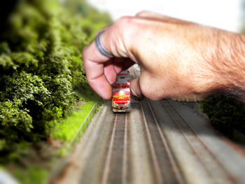
Images by Dingo2494 and Photo Munki Deluxe on flickr. Hooray, for Creative Commons and for silly usernames.
The end!
That was my second photography article, I hope it was a better sequel to its predecessor than the Matrix Reloaded was. Feel free to post comments or ask questions below.
Just wanted to say “Thanks!” for the excellent depth of field article; I learned a lot from it. Got a new Rebel XTi on the way, so hopefully I’ll be able to put your knowledge to use soon. Take care!
*Great* article!
Just finished reading this and the beginner’s guide, you are a very talented gentleman and were you not apparently married already, i would have to propose to you. Purleeeeeaaaase could you do something on macros, i’d like to get a little closer than the 40″ (or something similarly poor) minimum focus distance on my kit lense, but am confused to death about macro lenses, “close up filters”, “extension tubes” and various methods mentioned on flickr which seem to be suggesting sticking a lense on backwards. Ideally, illustrated with pictures of the kit concerned and how you plug it all together, too (i know, i don’t ask much..)
Aw shucks. I don’t get comments like these for my computer programming articles :)
In order to use the kit lens for macro work, you could buy the Canon 12mm extension tube which will allow you to get right up close to a subject so it will appear larger. However, you will only have a few centimetres between the lens and your subject, so photographing skittish insects is out.
Personally I use a 500D close-up attachment on a 70-300 telephoto zoom. It’s basically a magnifying glass that screws onto the front of the lens and allows you to focus close. You can get good pictures of insects from a couple of feet away. If you can afford a 70-300, this is the most comfortable way of shooting macro, and allows you to do stuff like this: https://flic.kr/p/4iEuKr
The extension tubes work for normal and wide lenses like your kit lens, the 500D works for telephoto lenses.
Thanks for the article. Its rare to find something so well written that has good depth. I often find the web full of ultra basic or ultra geeky stuff with no in-between like yours.
dan
I read the line about casting your voice as that of Ian McKellen in my head and instantly reverted…it really was perfect. Thanks for such a well-written article! If only college textbooks were this clear! :P
Great Job on the SLR’s beginners guide. Almost all online introductions I read leave me “What the $#@” after reading it. Your article has been printed and put in my camera bag. I’m just looking at getting into the photography field (I am already a Geek) to enhance my print/graphics business. Thanks for the comic relief throughout!!
Thanks for the in-depth (pun intended) explanation! I am going to go play with all of these new ideas.
Thanks for a great article. I just bought my first SLR and probably spent more on it than is healthy but I really wanted something to grow into, and I’m very happy with the Nikon D300 I bought. Finding good guides has been hard but I really think you have done a superb job. Keep up the good work and thanks for alleviating my growing pains ;)
Thanks for a couple of superb articles ! I have your first one and the depth of field one, and they are superb !!! Keep up the good work !
Simon – Selkirk, Scotland !
Hey just wanted to say thank you for taking the time to write this informative and in depth article!! I have only really begun to get into digital photography since March when I bought my Nikon D300 and definitely still learning. My pursuit of this material started with a question that came to mind as I am reading about a digital point-and-shoot that I am considering. It has a max aperture of f2.8, the same as my much larger Nikon 70-200mm f2.8 lens. That struck me as confusing so I looked for an answer. You article helped me understand! Thanks
Kyle
I was going through the beginner’s guide to photographic technique for geeks. This is the kind of information I was looking for a long long time.
Thanks a lot.
Ajith
Wow! Thank you so much for this depth of field article and your beginners guide. It is exactly what I needed! The depth *haha pardon the pun* was amazing and you explained everything very clearly.
Thank you thank you!!
hi bernie
fist thanks for the time and the effort you put in explaining all the subject related to photography.
i m new in landscape photography , i m interested in hyperfocal distance. after reading your blog and others i started to understand this concept , but what confuses me more is the chart from http://www.dofmaster.com/doftable.html could you please explain to me what is the relation between , distance , near , far, and hyperfocal distance. and what distance this chart refer to 1….100
thanks
Hey superb post, i recognize that this is a little bit of off topic however is the Telephoto EF 100mm f/2.8 USM Macro Autofocus Lens worth it? i’ve read a few reports but on the other hand i wouldn’t like to throw away $480 on it. also are there any beneficial message boards that i could possibly participate in photography thanks Charles in the the united kingdom…english is not my first language
I’m going on my 2nd yr in the photography field & I am discovering new stuff all the time, such as this posting – many thanks for this blog. Jennifer
Thanks very much for your method of explaining things, very easy to understand the most complicated subject. I am just a happy single mom, had to learn to record golden moments of my two children about 6 years ago. I took a basic class at a local college at that time, and took good pictures with film / luck more than skill, then bought a few more P&S digital camera for my kids, canon G9 is one of them, it is traveling to my son to Ghana right now-it takes good pictures. I finally bought a Canon 7D for my trip-visit and watch my daughter performing on the stage at her university next month. I started searching and your site popped up and thanks again. Good luck for your trip.
Great article! It is suitable for anyone from beginners to those sophisticated guys.
hey! nice article. I was wondering though, can the blur still be measured when you already used a software on the image? example, helicon focus. or adobe photoshop. how can you say that it has a greater depth of field than the image which is not edited? you can’t just say it’s clearer, too. is there any way to measure depth of field when a software has already edited it?
Good question. Depth of field is really a property that applies to optical systems and the images that they produce. Once you’ve edited an image or combined several images together then all statements about depth of field no longer have their strict technical meanings. You could go by aesthetics and say “This edited photo seems to have half the depth of field of the original”, but that’s a human judgement, not a technical statement.
i wanna ask again, how exactly do you get the value for the minimum circle of confusion? i kinda don’t get it. there’s the 0.2 mm, then the 25 cm, then suddenly there goes the 1/1250. please enlighten me! thanks vm
Good article. But, I’d should like to clarify one point. . .
When you speak of measuring blur in the real world, you are not really measuring in the real world, but are extrapolating the amount of blur you see in the image to how large that would be given the actual size of the subject or object being blurred in the image. Is that correct?
Cracking article – thank you!